

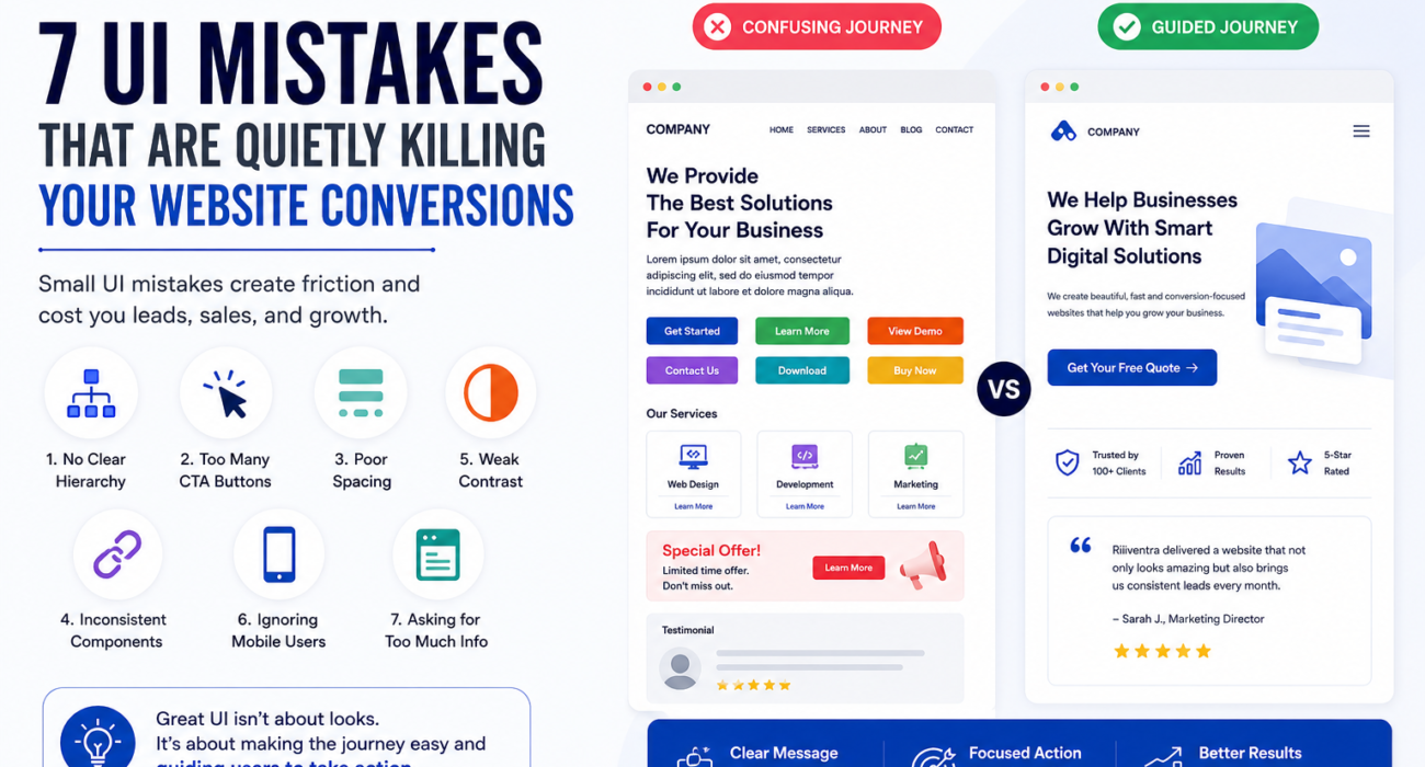
First Impressions Matter More Than Ever
Your website has only a few seconds to convince visitors they’re in the right place.
While businesses often focus on adding new features, animations, or flashy visuals, the real reason many websites fail to convert is much simpler: poor User Interface (UI) design.
A confusing interface creates friction. Every unnecessary click, cluttered section, or unclear call-to-action increases the chances that a visitor will leave your website without taking action.
Let’s explore seven common UI mistakes that silently reduce conversions—and how you can fix them.
1. No Clear Visual Hierarchy
Visitors shouldn’t have to search for your main message.
A well-designed page naturally guides users from the headline to supporting information and finally to a clear call-to-action.
Best Practices
- Use larger headings for important content.
- Highlight primary buttons.
- Organize information logically.
- Make your value proposition visible immediately.
2. Too Many Call-to-Action Buttons
When every button asks users to click, they often click nothing.
Instead of presenting multiple competing actions, each section should focus on one clear objective.
Example
❌ Contact Us | Get Quote | Book Demo | Learn More | Download PDF
✅ Get Your Free Quote
The simpler the decision, the higher the conversion rate.
3. Poor Spacing Creates Cognitive Overload
Whitespace isn’t wasted space.
Proper spacing improves readability, helps users scan content faster, and makes your website feel more professional.
When everything is packed together, visitors struggle to identify what’s important.
Improve spacing by:
- Increasing padding around sections.
- Adding margins between elements.
- Keeping paragraphs short.
- Breaking large blocks of text into digestible sections.
4. Inconsistent Buttons and Components
Buttons should look and behave consistently throughout your website.
If every page uses different colors, shapes, and styles, users lose confidence and navigation becomes confusing.
Maintain consistency with:
- Button colors
- Border radius
- Hover effects
- Typography
- Icons
- Form styles
Consistency creates familiarity, and familiarity builds trust.
5. Weak Contrast Reduces Readability
One of the most overlooked UI mistakes is poor color contrast.
Light gray text on a white background may look elegant, but if visitors can’t comfortably read your content, they won’t stay long.
Improve readability by:
- Using dark text on light backgrounds.
- Maintaining strong contrast between buttons and backgrounds.
- Choosing accessible font sizes.
- Testing your website on different screens.
6. Ignoring Mobile Users
More than half of web traffic now comes from smartphones.
A desktop-first website often results in:
- Tiny buttons
- Hard-to-read text
- Broken layouts
- Difficult navigation
Designing mobile-first ensures your website works seamlessly on every device.
Always test:
- Navigation
- Forms
- Buttons
- Images
- Page speed
7. Asking for Too Much Information
Long forms discourage conversions.
If users only want a quote, don’t ask for unnecessary information.
Every additional field increases friction.
Keep forms simple
Instead of asking for:
- Full address
- Company size
- Budget
- Industry
- Multiple phone numbers
Start with:
- Name
- Phone number
- Message
You can always collect additional details later.
A Quick UI Audit You Can Do Today
Open your homepage and answer these questions:
✔ Can visitors understand what your business does within five seconds?
✔ Is there one primary call-to-action above the fold?
✔ Is your text easy to read?
✔ Does your website feel clean and uncluttered?
✔ Does it work perfectly on mobile devices?
✔ Are buttons consistent across every page?
✔ Would you trust your own website if you were a first-time visitor?
If you answered “No” to any of these questions, you’ve identified opportunities to improve your website.
Why Great UI Drives Better Business Results
Good UI isn’t just about aesthetics.
It’s about creating an effortless experience that helps visitors accomplish their goals while helping your business generate more leads and sales.
A well-designed interface can:
- Increase conversion rates
- Improve customer trust
- Reduce bounce rates
- Improve mobile usability
- Strengthen brand credibility
- Support better SEO performance
- Increase customer satisfaction
Small UI improvements often deliver significant business results.
Final Thoughts
Every click on your website should feel natural.
Every page should have a purpose.
Every design decision should make it easier for visitors to become customers.
Instead of asking, “Does my website look modern?”, ask:
“Can my visitors achieve their goal without confusion?”
That’s the true measure of great UI design.
At Riiventra, we build websites that don’t just look professional—they’re designed to create exceptional user experiences and drive measurable business growth.