

A website can have a beautiful design, fast loading times, and a smooth checkout process. But there is one part of the user experience that businesses often overlook: what happens when something goes wrong.
A customer enters the wrong password.
A payment fails.
A contact form doesn’t submit.
A page cannot be found.
An API stops responding.
These situations are unavoidable. What matters is how your website communicates with the user when they happen.
A poor error message can create frustration and make users leave. A well-designed error message can guide them toward a solution and keep them moving forward.
Why Error Messages Matter
Error messages are not just technical notifications. They are part of your overall user experience (UX).
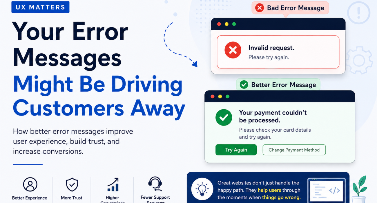
Consider these two messages:
“Invalid request.”
Now compare it with:
“Your payment couldn’t be processed. Please check your card details and try again.”
The second message immediately gives the user more useful information.
They know:
- What went wrong
- What caused the problem
- What they can do next
That small difference can significantly improve the experience.
The Problem With Generic Error Messages
Many websites still use vague messages such as:
- “Something went wrong.”
- “Invalid request.”
- “Error occurred.”
- “Please try again.”
- “Unexpected error.”
These messages may technically indicate that something failed, but they don’t help the user solve the problem.
Imagine a customer spending several minutes filling out a form and then receiving:
“Something went wrong.”
What should they do?
Should they refresh the page?
Check their internet connection?
Fill the form again?
Contact support?
The user is forced to guess.
And when users have to guess, frustration increases.
A Good Error Message Answers 3 Questions
A useful error message should answer three simple questions.
1. What happened?
Clearly explain the problem.
Instead of:
“Invalid input.”
Try:
“The email address you entered isn’t valid.”
The user immediately understands the issue.
2. Why did it happen?
When possible, explain the reason.
For example:
“Your password must contain at least 8 characters.”
This is much more useful than:
“Invalid password.”
The explanation tells the user exactly what needs to change.
3. What should the user do next?
Always provide a clear path forward when possible.
For example:
“Your payment couldn’t be processed. Please check your card details and try again.”
Even better, provide a relevant action:
[Try Again]
or
[Change Payment Method]
The goal isn’t simply to tell users that something failed.
The goal is to help them recover.
Error Messages Should Sound Human
Technical language may make sense to developers, but it often doesn’t make sense to customers.
For example:
❌ “HTTP 500 Internal Server Error”
A developer understands this.
A typical customer probably doesn’t.
A better message might be:
“We’re having trouble loading this page right now. Please try again in a few moments.”
The technical error can still be recorded in your logs for developers while the customer receives a simple explanation.
Don’t Blame the User
Error messages should also avoid making users feel like they did something wrong.
Compare:
❌ “You entered an invalid email.”
with:
✅ “Please enter a valid email address.”
The second version is more helpful and less confrontational.
Good UX should guide users rather than criticize them.
Give Users a Way Forward
An error message without an action is often incomplete.
For example:
“Your session has expired.”
That’s useful information, but what happens next?
A better experience would be:
“Your session has expired. Please sign in again to continue.”
Then provide a:
Sign In Again
button.
This principle applies across websites and applications.
When something fails, ask:
“What is the next thing the user needs to do?”
Then make that action easy to find.
Common Examples of Better Error Messages
Login
❌ “Login failed.”
✅ “The email or password doesn’t match. Please check your details and try again.”
Payment
❌ “Payment error.”
✅ “Your payment couldn’t be processed. Please check your card details or try another payment method.”
Contact Form
❌ “Submission failed.”
✅ “We couldn’t send your message. Please check the required fields and try again.”
Password
❌ “Invalid password.”
✅ “Your password must contain at least 8 characters, including a number.”
404 Page
❌ “404 Page Not Found.”
✅ “We couldn’t find the page you’re looking for. Try searching below or return to the homepage.”
The difference is simple: the second version helps the user recover.
Good UX Handles the Unhappy Path
When designing a website, businesses often focus on the ideal customer journey:
Homepage → Product → Checkout → Purchase
But real users don’t always follow the ideal path.
They make mistakes.
They enter incorrect information.
They lose their connection.
They forget passwords.
Payments fail.
Links break.
Servers experience problems.
That’s why good UX design considers both the happy path and the unhappy path.
A great website doesn’t only ask:
“What happens when everything works?”
It also asks:
“What happens when something doesn’t?”
Better Error Messages Can Reduce Support Requests
Clear error messages can also help reduce unnecessary customer support requests.
If users understand:
- What went wrong
- Why it happened
- How to fix it
they may not need to contact your support team.
That means a small UX improvement can potentially create benefits across your business:
Better UX → Less frustration → Fewer support requests → Better customer experience
Error Handling Is Part of Your Brand
Every interaction contributes to how customers perceive your business.
Your brand isn’t represented only by your logo, colors, and website design.
It’s also represented by how your website behaves when something goes wrong.
A helpful error message communicates:
“We understand what happened, and we’re here to help you fix it.”
A confusing error message communicates the opposite.
A Simple Checklist for Better Error Messages
Before launching your website or application, review your error states.
Ask:
☑ Is the problem clearly explained?
☑ Can a non-technical user understand the message?
☑ Does the message avoid unnecessary technical terminology?
☑ Does it explain why the problem happened when possible?
☑ Does it tell the user what to do next?
☑ Is there a clear action button when appropriate?
☑ Does the message avoid blaming the user?
☑ Have you tested errors on mobile devices?
☑ Have you considered what happens when the network fails?
☑ Are technical errors being logged for your development team?
Final Thoughts
The best websites aren’t designed only for perfect situations.
They’re designed for real people — and real people make mistakes.
A thoughtful error message can turn a frustrating moment into a guided experience.
Instead of simply saying:
“Something went wrong.”
Tell users:
What happened.
Why it happened.
What they should do next.
These may seem like small UX details, but small details often make the biggest difference in how customers experience your website.
Great websites don’t just handle the happy path. They help users recover when things go wrong.